Flutter: using Tabs - a simple demo
DefaultTabController is an inherited widget that is used to share a TabController with a TabBar or a TabBarView. It’s used when sharing an explicitly created TabController isn’t convenient because the tab bar widgets are created by a stateless parent widget or by different parent widgets.
To implement our Tabs demo it’s important to understand two main components:
TabBar
TabBar is Material Design widget that displays a horizontal row of tabs.
Typically created as the AppBar.bottom part of an AppBar and in conjunction with a TabBarView. The tab controller’s TabController.length must equal the length of the tabs list and the length of the TabBarView.children list. Requires one of its ancestors to be a Material widget.
TabBarView
TabBarView is a page view that displays the widget which corresponds to the currently selected tab.
This widget is typically used in conjunction with a TabBar. The tab controller’s TabController.length must equal the length of the children list and the length of the TabBar.tabs list.
Step 1 — Basic use

In our demo, the TabBar will be defined as:
const TabBar(
            tabs: [
              Tab(text: "Tab 0"),
              Tab(text: "Tab 1"),
              Tab(text: "Tab 2"),
            ],
          )
And the TabBarView will be defined as:
const TabBarView(
          children: [
            Center(child: Text('View 0')),
            Center(child: Text('View 1')),
            Center(child: Text('View 2')),
          ],
        )
The full code for our step1 will be:
import 'package:flutter/material.dart';

const Color darkBlue = Color.fromARGB(255, 18, 32, 47);

void main() {
  runApp(const MyApp());
}

class MyApp extends StatelessWidget {
  const MyApp({super.key});

  @override
  Widget build(BuildContext context) {
    return MaterialApp(
      theme: ThemeData.dark().copyWith(
        scaffoldBackgroundColor: darkBlue,
      ),
      debugShowCheckedModeBanner: false,
      home: const TabsDemo(),
    );
  }
}

class TabsDemo extends StatelessWidget {
  const TabsDemo({super.key});

  @override
  Widget build(BuildContext context) {
    return DefaultTabController(
      length: 3,
      child: Scaffold(
        appBar: AppBar(
          bottom: const TabBar(
            tabs: [
              Tab(text: "Tab 0"),
              Tab(text: "Tab 1"),
              Tab(text: "Tab 2"),
            ],
          ),
          title: const Text('Tabs Demo'),
        ),
        body: const TabBarView(
          children: [
            Center(child: Text('View 0')),
            Center(child: Text('View 1')),
            Center(child: Text('View 2')),
          ],
        ),
      ),
    );
  }
}
Notice that we have set the DefaultTabController‘s length argument to 3. This is a required argument. The [length] must match [TabBar.tabs]’s and [TabBarView.children]’s length.
You can also check the step 1 interactive demo.
Step 2 — Set a default Tab
The default Tab is 0. This means that when the TabBar is shown it will select by default the first Tab (position 0). If you want to set another Tab as the default you must set the `initialIndex` argument.
So let´s add it to our demo:
...
    return DefaultTabController(
      length: 3,
      initialIndex: 2, // remember the first is 0
...
You can check it running at step 2 interactive demo.
Step 3 — Listening to Tab change

Sometimes you want to run your own code when a user clicks on a diferent tab. To do this we’ll we need to expose the controller using a Builder and then add a listener. So we’ll change this:
return DefaultTabController(
      length: 3,
      child: Scaffold(
      ...
to this:
return DefaultTabController(
length: 3,
child: Builder(builder: (BuildContext context) {
final TabController controller = DefaultTabController.of(context);
controller.addListener(() {
if (!controller.indexIsChanging) {
... code that runs on tab change ...
}
}
return Scaffold(
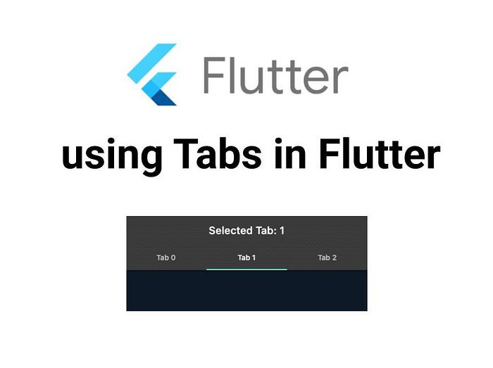
...In our Demo we’ll change our title to “Selected Tab:” and update the title text to display the selected tab index. This means we’ll need a StatefulWidget, so we need to convert our TabsDemo StatelessWidget.
we’ll change this:
class TabsDemo extends StatelessWidget {
  const TabsDemo({super.key});
to this:
class TabsDemo extends StatefulWidget {
  const TabsDemo({super.key});

  @override
  State<TabsDemo> createState() => _TabsDemoState();
}

class _TabsDemoState extends State<TabsDemo> {
We’ll also add some variables to hold the values for selected tab and the title text:
  int _selectedTab = 1;
  final String _title = "Selected Tab: ";
  String _fullTitle = "";
And we’ll initialize the _fullTitle variable with the _title + _selectedTab concatenation value:
  @override
  void initState() {
    _fullTitle = _title + _selectedTab.toString();
    super.initState();
  }
Now we’ll add the following code to the listener so when we click on a diferent tab this code will update the state of the app with _fullTitle new value:
          if (!controller.indexIsChanging) {
            _selectedTab = controller.index;
            setState(() {
              _fullTitle = _title + _selectedTab.toString();
            });
          }
The full code:
import 'package:flutter/material.dart';

const Color darkBlue = Color.fromARGB(255, 18, 32, 47);

void main() {
  runApp(const MyApp());
}

class MyApp extends StatelessWidget {
  const MyApp({super.key});

  @override
  Widget build(BuildContext context) {
    return MaterialApp(
      theme: ThemeData.dark().copyWith(
        scaffoldBackgroundColor: darkBlue,
      ),
      debugShowCheckedModeBanner: false,
      home: const TabsDemo(),
    );
  }
}

class TabsDemo extends StatefulWidget {
  const TabsDemo({super.key});

  @override
  State<TabsDemo> createState() => _TabsDemoState();
}

class _TabsDemoState extends State<TabsDemo> {
  int _selectedTab = 1;
  final String _title = "Selected Tab: ";
  String _fullTitle = "";

  @override
  void initState() {
    _fullTitle = _title + _selectedTab.toString();
    super.initState();
  }

  @override
  Widget build(BuildContext context) {
    return DefaultTabController(
      length: 3,
      initialIndex: _selectedTab,
      child: Builder(builder: (BuildContext context) {
        final TabController controller = DefaultTabController.of(context)!;
        controller.addListener(() {
          if (!controller.indexIsChanging) {
            _selectedTab = controller.index;
            setState(() {
              _fullTitle = _title + _selectedTab.toString();
            });
          }
        });
        return Scaffold(
          appBar: AppBar(
            bottom: const TabBar(
              tabs: [
                Tab(text: "Tab 0"),
                Tab(text: "Tab 1"),
                Tab(text: "Tab 2"),
              ],
            ),
            title: Text(_fullTitle),
          ),
          body: const TabBarView(
            children: [
              Center(child: Text('View 0')),
              Center(child: Text('View 1')),
              Center(child: Text('View 2')),
            ],
          ),
        );
      }),
    );
  }
}
And you can try it at step 3 interactive demo.


Comments
Post a Comment